
For this first discovery of Eyetracking with a webcam, we used the website RealEye.io and had to propose 4 tasks to a colleague in the class. The person who carried out the 4 tasks was Karen B.
Test protocol
Hello!
You are about to take part in an eye tracking test. Please do not move your head during the test. Try to keep the brightness the same throughout the test. This should take no more than 5 minutes.
Sometimes you'll have to answer a few questions after the image appears.
Task 1 – website amazon.fr
Amazon is a popular e-commerce site. This site displays a lot of content on the home page. It can be difficult to find information if you don't have a clear idea of what you're looking for.
For the first test, the aim was to identify and click on "Top categories" in the bottom middle of the amazon page in 5 seconds. Scrolling was activated.
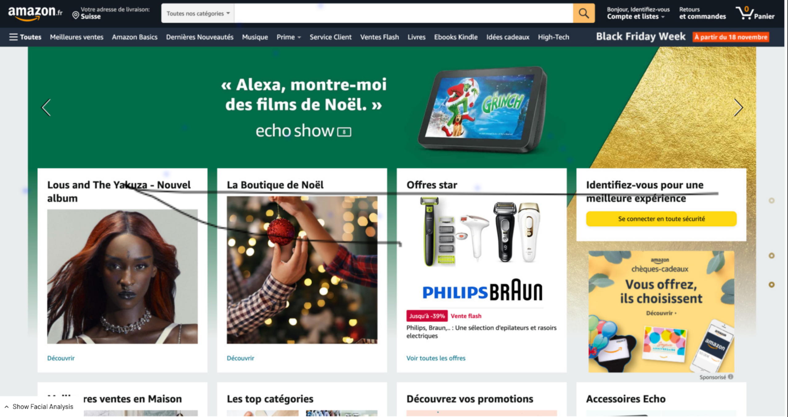
Here, mouse movement is displayed and it can be seen that no clicks or scrolls have been performed.
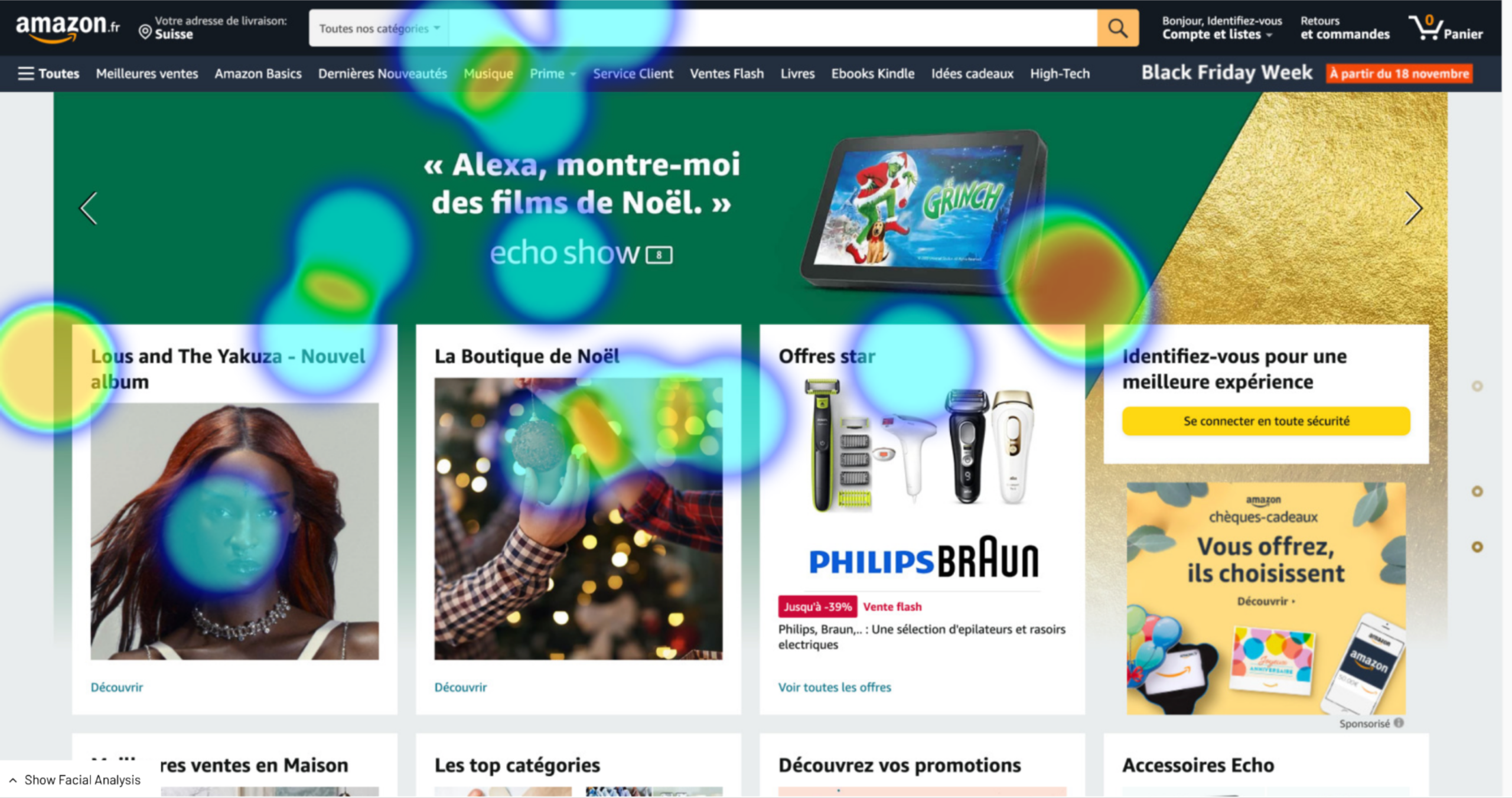
As you can see from the heatmap, no eyes were directed to the bottom of the page. Attention is mainly focused on the upper half of the page.
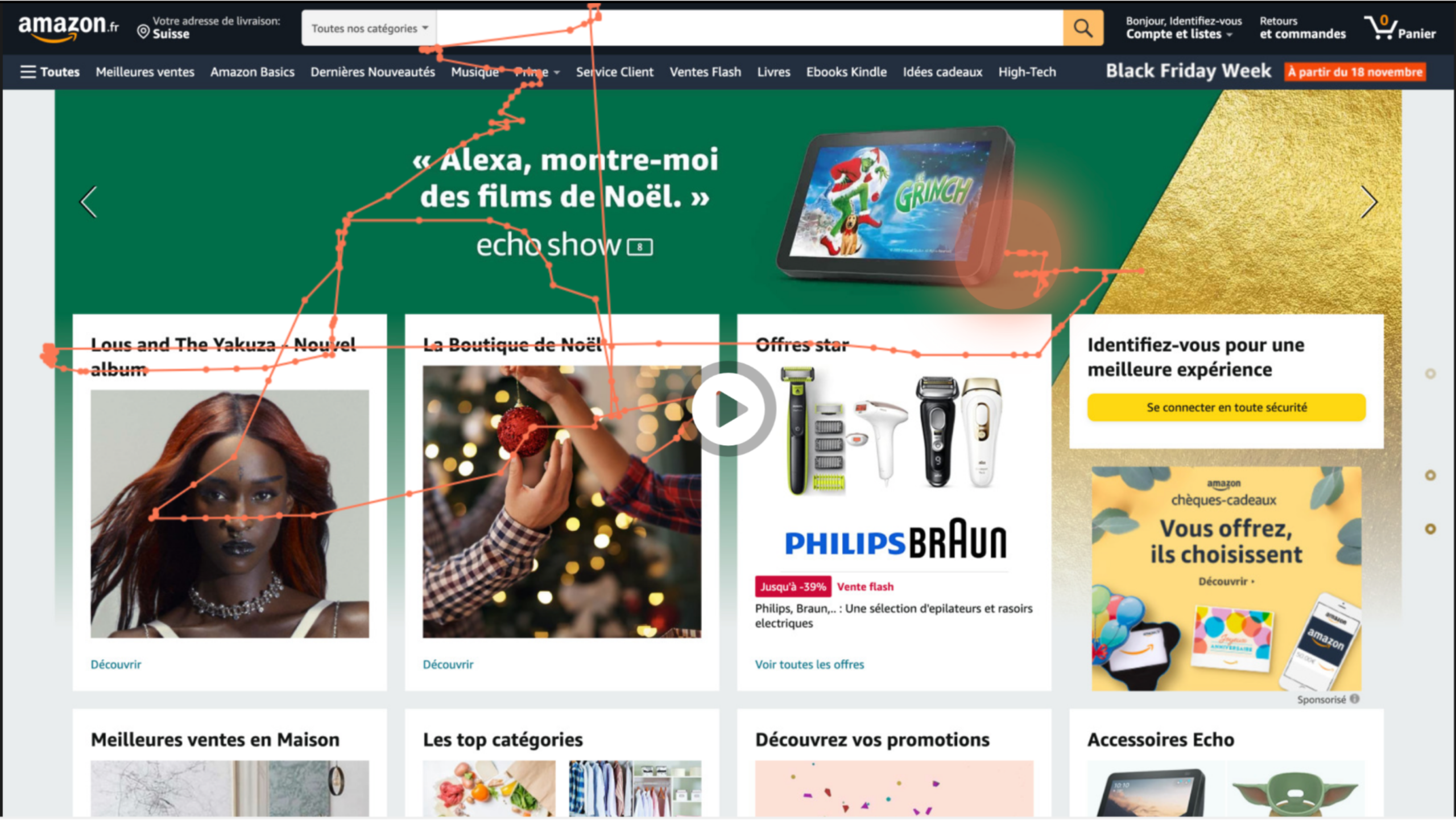
The fixation points show that Karen's reflexes are to go to the category bar and the lower boxes. As mentioned above, the gaze points are located mainly in the upper half of the screen.
Conclusion: An increase in time would have enabled a better analysis of the page and therefore a better conclusion. Taking information from the bottom of the page and cutting it off is not a good idea. People don't have the reflex to look down or scroll. It would have been preferable to use the category bar at the top of the page to do the test, to increase the image analysis time and to indicate the possibility of scrolling. It's difficult to give any recommendations here.
Task 2 - website happyofficine.ch
The happy officine website is an e-commerce site selling organic cosmetics from French and American brands.
For this second task, the aim was to understand whether the information was clear and whether people understood what the site contained. To do this, the test person was given 5 seconds to look at the site (5 seconds test) and asked a few questions:
- What was the first thing you noticed?
- What does this site sell?
- What is this site about?
- Do you trust this site?
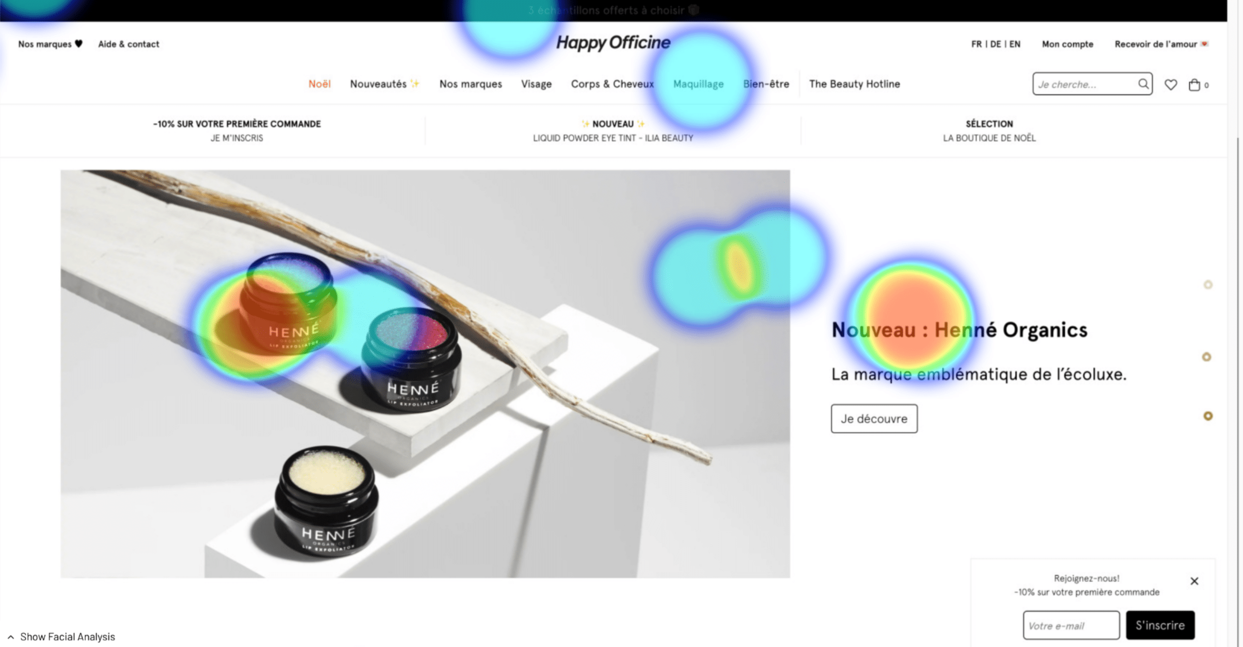
The two main points of attention are on the image and on the title to its right.

For the fixation points, the test person actually starts by looking at the product, then the title, and then ends her observation on the navigation bar.
After this analysis, unsurprisingly, the person replied that it was the pots that he noticed first. Indeed, being located on the left and with this size, it's hard not to be visually attracted by the pots. She grasped that this was a site selling make-up. The subject of the site was not found. Confidence in the site is high.
Conclusion: The site appears confident at first glance, and it quickly becomes clear that this site sells make-up. After that, the fact that these are "natural and organic brands" is not emphasized enough. Without the image of the jars, it would be difficult to know what this site contains.
TASK 3 - MEGA22 EVENT FLYER
For this third task, I decided to use the flyer for the MEGA 22 event, organized for graduates in media engineering.
Here, the aim was to find out whether the hierarchy of information made it possible to quickly retain the information put forward. The person was asked to look at the poster for 5 seconds, and then to answer three questions after the test:
-
Who is organizing the event?
-
When is the event taking place?
-
Where does the event take place?
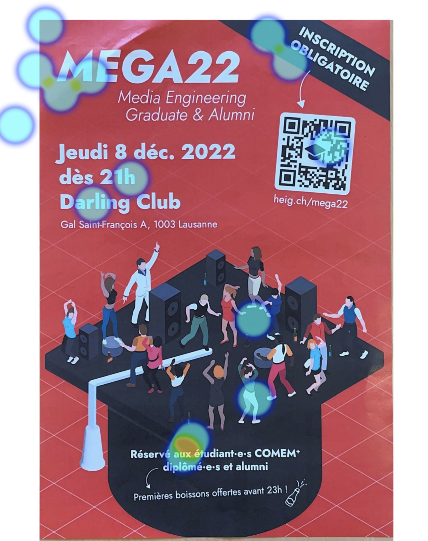
On the heatmap, we can see that the parts with text attracted the most attention, i.e. the title, the inscription and the text at the bottom.
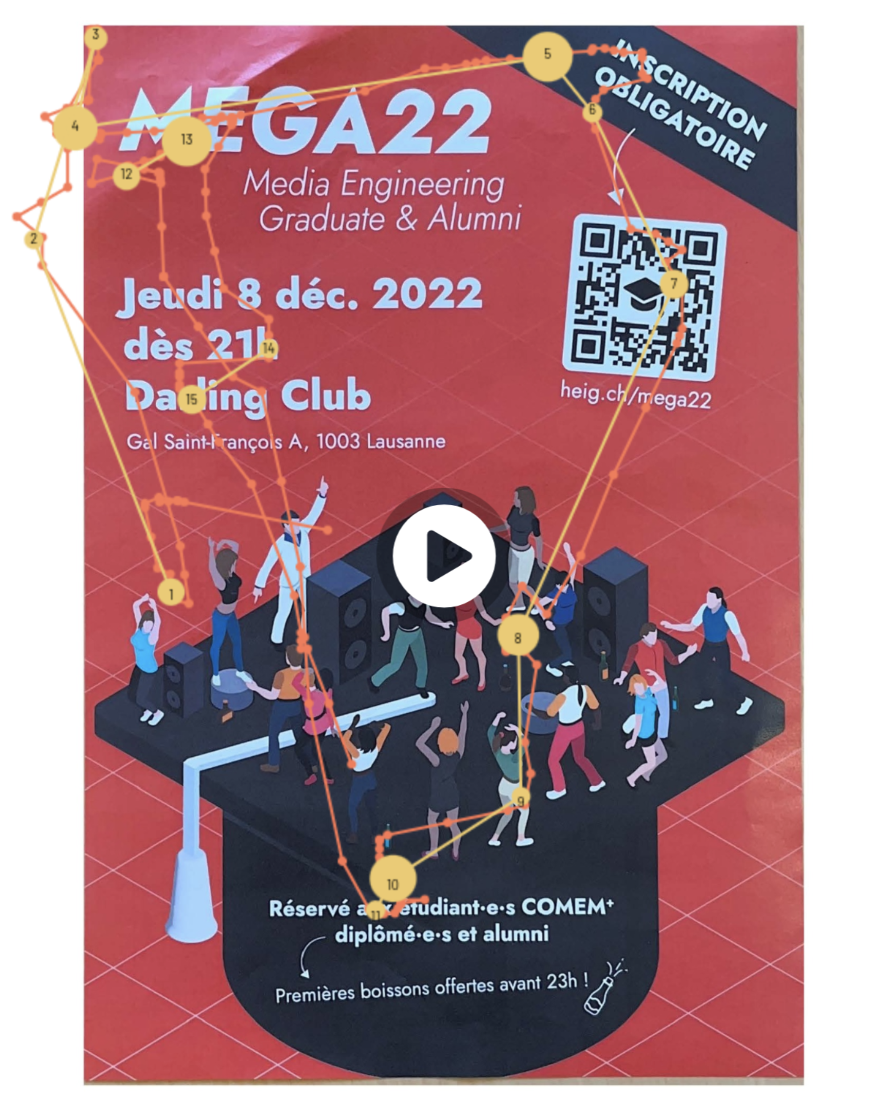
The fixation points are mainly on the title. Karen stopped first at the title and then examined the poster in a clockwise direction (title - compulsory inscription - QR code - bottom text - date).
Karen replied that the HEIG was organizing the event. This may have been biased by the fact that the poster is displayed in the school corridors. For the date and place of the event, the answers were not found, due to lack of time.
Conclusion: On the poster, the visual hierarchy in terms of font size and location is good, since the points of attention and fixation are located where the bold text is. I think that if the time had been doubled, the person would have been able to retain the information requested.
TASK 4 - website ADHEREUP.CH adhereup.ch
This showcase site belongs to a start-up that wants to find investors. The information needed to be easily and quickly understood on arrival at the site, so as to keep the person's attention.
For the final task, the user had to look at the site again for 5 seconds and answer two questions:
- What is the company name?
- What is the site about?
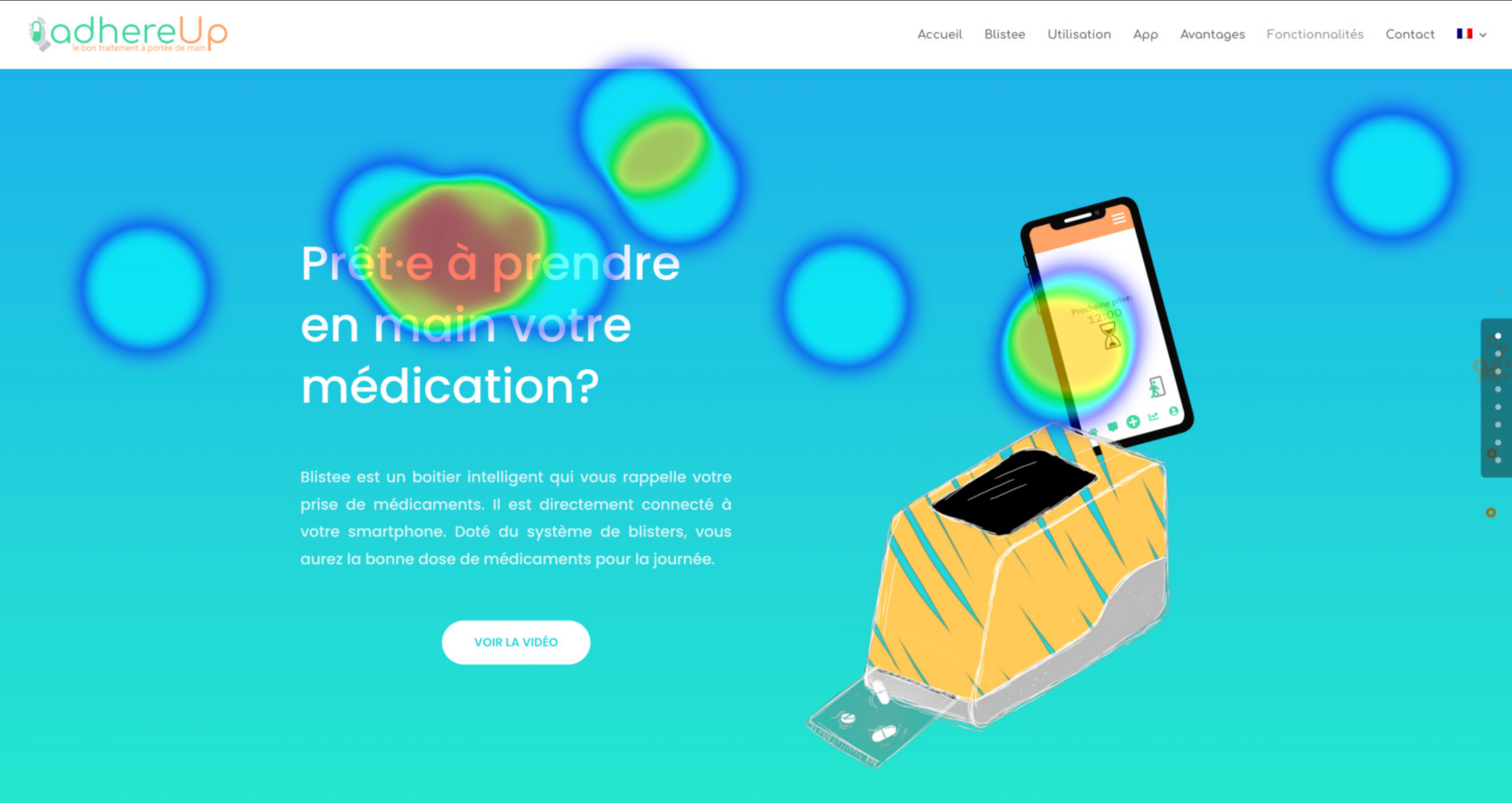
Here, the heatmap shows that the catchphrase caught Karen's attention, as did the image on the right.
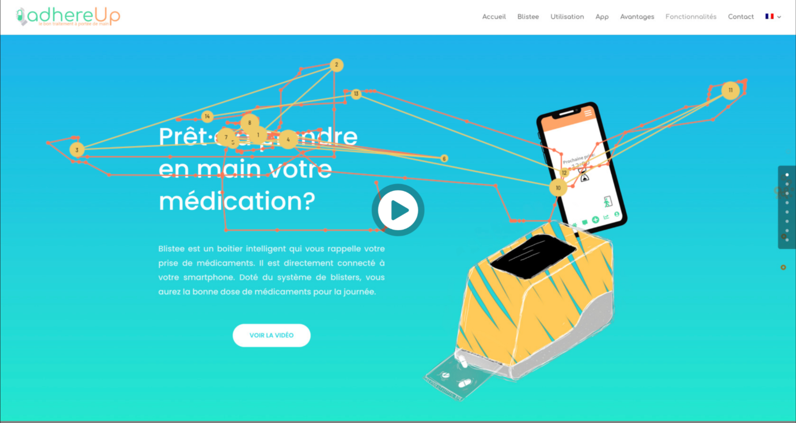
The gaze points are located on both the catchphrase and the phone image,
With the gaze dots, we can see that Karen didn't look at the logo on the top left at all. This explains why the company name couldn't be memorized. Karen understood that the subject of the site was the medication featured in the catchphrase.
Conclusion: In order to be able to understand what the site is trying to sell, the product name, for example, should be highlighted in bold or next to the image, rather than drowned out in the paragraph. The logo could be placed in the middle of the image to catch the eye quickly.
GENERAL CONCLUSION
As this is my first experience, there are a number of improvements that I'd like to take into account for next time.
Firstly, the time allowed for a task should be at least 10 seconds (unless it's a 5 second test). Indeed, for the questions asked after the test, the person often mentioned the lack of time they had to analyze the image. They couldn't answer the questions or perform the action requested. We'd need to be able to run a rough test with an average person to be able to gauge the time needed for each task.
Secondly, for the first task, the mistake was to have taken a piece of information to be found at the very bottom of the page, so it wasn't very visible (and even less so in 5 seconds!). In fact, attention is not focused there, but towards the top of the page.
In conclusion, RealEye.io was generally easy to get to grips with. This first approach enabled us to discover the different means of analysis possible with this tool for UX testing.
